
Menu – Hollywood Sandwich Shoppe
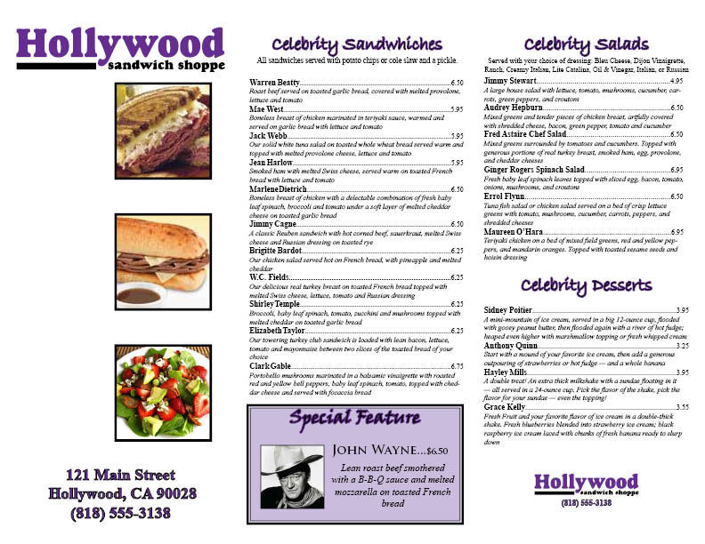
For this project we were instructed to create a Menu for a local Sandwich Shop in Hollywood California. As you can tell I used a three-fold pamphlet layout for my design. The cover has the name and address of the sandwich shop accompanied by a few pictures to entice customers. The logo provided used the colors purple and black, so I kept with this color scheme to bring unity to the menu. The differentiation of font styles breaks the menu up nicely and much emphasis is placed on the special feature sandwich as it is encased in a purple box which secludes it from the rest of the menu.
Poster – Sawdust Festival

For this project we were instructed to create a poster to publicize an annual art festival called the Sawdust Festival. For this project I searched for the original Sawdust Festival logo. I used the same logo twice in this project; first to create a residual background image and then again superimposed on top, this time with a picture of a crowd of people inlaid within the logo. I used hues from the original logo to create unity and used the picture of the crowd of people to try and suggest that a lot of people attend the festival. The black outlining of the letters is necessary to help make the white text more legible.
Calendar
For this project we were told to create a usable calendar that had a picture, fun fact, and added monthly coupons. I figured that everyone likes pictures of baby animals so thats what each graphic in the designated area was. Originally I formatted a single month and then created duplicate documents with the pattern. I tried to use bright colors due to the playful nature of the calendar and I grayscaled the remaining squares to differentiate them from the rest of the days of the month.